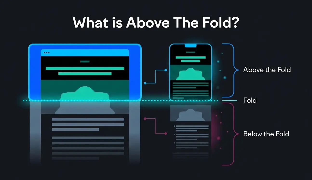
Quick Answer: “Above the fold” is the visible area of a web page that appears without any scrolling. It is where first impressions are formed, and where the decision to stay or leave is made usually within the first 50 milliseconds of a page load.
The Origins of “Above the Fold”: From Newspapers to Web Browsers
The phrase “above the fold” was born in the newspaper industry. When papers were folded and stacked at newsstands, only the top half of the front page was visible. Editors knew that the content in that upper half would determine whether a passerby picked up the paper and paid for it. Every headline, photograph, and story placement was a calculated decision.
When the internet arrived and web designers needed a way to talk about the most visible area of a screen, they borrowed the term directly. The logic translated perfectly: just as newspaper readers see only what is above the physical fold, web visitors see only what fits on their screen before they choose to scroll.

What has changed is everything else. In the early web era roughly 1995 to 2010 most designers built for a single screen width of around 800 pixels. The fold was predictable. Then mobile happened, then tablets, then 4K monitors, and suddenly “the fold” became a moving target that shifts based on device, browser, resolution, and even font size preferences. But its importance? That has never wavered.
“The fold” is no longer a fixed line it is a range. But the principle it represents, capturing attention before a visitor decides to scroll, is as critical today as it was in 1997.
Why Above the Fold Still Matters in 2026
Every few years, someone publishes an article proclaiming “the fold is dead.” In my experience, the people who believe that tend to have high bounce rates. Here is why above the fold is just as relevant arguably more relevant than ever:

Attention Is Shorter Than Ever
Research from Google found that users form an impression of a website in less than 50 milliseconds. That is half of one tenth of a second. The only content a visitor can possibly evaluate in that window is above the fold. In that moment, they are deciding one thing: “Is this worth my time?”
Bounce Rates Are Won or Lost Above the Fold
In my work auditing hundreds of landing pages, I consistently find that pages with unclear or cluttered above the fold sections have bounce rates between 65% and 80%. After optimizing that first view sharpening the headline, clarifying the CTA, removing friction bounce rates routinely drop by 20 to 30 percentage points. That is not a marginal improvement; that is transformational.
SEO Now Rewards Above-the-Fold Quality
Google’s Page Experience signals and Core Web Vitals directly reward pages that load cleanly and deliver value fast. The Largest Contentful Paint (LCP) metric specifically measures how quickly the main content above the fold loads. A slow or heavy above-the-fold section does not just frustrate users it actively hurts your search rankings.
Mobile Users Scroll, But Only If You Earn It
A common misconception is that because modern users scroll naturally on mobile, the fold does not matter. What the data actually shows is that scrolling is conditional. Users will scroll but only if the above-the-fold content gives them a reason to. If your first view does not communicate value, they leave. Full stop.
The Fold Is Not Fixed: Understanding Device Variability
One of the most important things I tell every client is this: there is no single fold line. The visible area on page load changes based on:
- Device type Desktop, laptop, tablet, and mobile all show very different amounts of content
- Screen resolution A 1080p monitor and a 4K monitor at the same physical size show different content amounts
- Browser chrome Navigation bars, bookmarks bars, and toolbars eat into visible height
- User zoom settings Accessibility zoom preferences can push content below the fold entirely
- Operating system UI System notification bars and bottom navigation reduce available viewport height

In practical terms, mobile devices in portrait orientation typically show around 500 to 700 pixels of vertical content. Desktop browsers show anywhere from 600 to over 1,000 pixels depending on the setup. This means you cannot design above-the-fold content for a single breakpoint.
What I recommend to every client: design and test your above-the-fold section at three breakpoints mobile portrait (375px wide), tablet (768px wide), and desktop (1280px wide). Use heat-mapping tools and **scroll depth analytics** to understand what real users actually see at each breakpoint.
Rule of thumb: design your above-the-fold content to work perfectly at 600 pixels of visible height. Anything below that threshold is a bonus, not a guarantee.
For advice on implementing a responsive layout, consult Google’s help guide.
What to Put Above the Fold (and What to Leave Out)
In my experience, the biggest mistake teams make is trying to fit too much into the above the fold area. The result is cognitive overload, which is worse than saying too little. Here is a clear breakdown of what belongs and what does not.
Must-Have Elements Above the Fold
| Element | Include Above Fold? | Why It Matters |
| Primary Headline | ✅ Always | Communicates what the page is about in 1 second |
| Subheadline / Supporting Copy | ✅ Always | Clarifies who this is for and what they get |
| Primary CTA Button | ✅ Always | Converts visitors who are already convinced |
| Navigation / Logo | ✅ Always | Establishes trust and brand identity instantly |
| Hero Visual (image/video) | ✅ Usually | Reinforces the headline emotionally |
| Social Proof (count/logos) | ⚡ Sometimes | Builds credibility use sparingly |
| Pricing Details | ❌ Rarely | Too much detail too soon; move below fold |
| Feature Lists / Bullets | ❌ Rarely | Creates clutter; belongs in the detail section |
| Multiple CTAs | ❌ Never | Choice paralysis kills conversions |
My rule: if an element does not directly answer “What is this page and what should I do next?”, it belongs below the fold.
The Anatomy of a High-Converting Above-the-Fold Section
After testing hundreds of combinations across industries, here is the structure I recommend to clients as a starting point:
- Navigation bar: Logo left, 3 to 5 links center/right, primary CTA button far right
- Headline (H1): Outcome-focused, 6 to 12 words, no jargon. “Turn Website Visitors Into Paying Customers” not “Innovative Digital Solutions”
- Subheadline: One sentence that clarifies who this is for and how it works
- CTA button: Action verb + benefit. “Start My Free Trial” not just “Sign Up.” High contrast color.
- Hero Serction: Supports the headline. Shows the product in use or communicates the emotional outcome
How to Optimize Your Above the Fold Content: 5 Proven Steps
Step 1: Define Your Single Goal
Before touching a pixel, ask: what is the ONE action I want visitors to take from this page? Sign up? Book a call? Buy a product? Every element above the fold should point toward that single outcome. When I audit pages with high bounce rates, the most common culprit is competing goals pulling the visitor in multiple directions.
Step 2: Craft an Outcome-Driven Headline
Your H1 headline is the most important piece of copy on the page. In my experience, the best headlines follow a simple formula: [Desired Outcome] + [For Whom] + [Optional: Differentiator]. Avoid clever wordplay, industry jargon, and vague claims like “We help businesses grow.” Tell visitors exactly what they get. Test at least 3 headline variations before committing to one.
Step 3: Select the Right Hero Visual
The visual should reinforce not distract from your headline. I have seen gorgeous hero images tank conversion rates because they were emotionally inconsistent with the copy. If your headline promises speed and efficiency, your visual should communicate speed and efficiency. SaaS companies tend to do well with product screenshots or short demo loops. Service businesses often convert better with a human face that matches their target customer.
Step 4: Place and Design Your CTA
Your primary CTA button should be visible without squinting and impossible to miss. Use a color that does not appear elsewhere on the page. Size matters: I typically recommend a minimum of 44px height for mobile tap targets and 36px on desktop. The label should start with an action verb and include a benefit wherever possible: “Get My Free Report,” “Start Saving Today,” or “Book a Strategy Call” all outperform generic labels like “Submit” or “Click Here.”
Step 5: Run Structured A/B Tests
Never assume you know what works best. I use **conversion rate optimization** (CRO) testing tools to run structured experiments with one variable changed at a time. Test the headline first it usually has the biggest impact. Then the CTA label, then the visual. Give each test at least two weeks and a minimum of 200 to 300 visitors per variation before drawing conclusions. The compounding effect of incremental above-the-fold improvements is remarkable over a 12-month period.
Above the Fold vs. Below the Fold: How They Work Together
The fold is not a finish line it is a starting line. A common mistake I see is treating above the fold as the entire website strategy, leaving below the fold as an afterthought. In reality, both zones serve distinct and complementary purposes.
| Aspect | Above the Fold | Below the Fold |
| Primary Role | Make the promise | Deliver the proof |
| Content Type | Headline, subhead, CTA, hero visual | Features, testimonials, FAQs, case studies |
| Visitor State | Skeptical, evaluating quickly | Interested, wanting more detail |
| CTA Density | 1 primary CTA | Multiple CTAs at natural decision points |
| SEO Focus | Primary keyword in H1, LCP optimization | Secondary keywords, schema, internal links |
| Visual Style | Bold, high contrast, minimal clutter | More detailed, informative, trust-building |
Above the fold makes the promise; below the fold keeps it. Both zones need equal design attention.
I think of above the fold as the book cover and below the fold as the first chapter. A great cover makes someone open the book. A great first chapter makes them read the whole thing. You need both.
Common Above the Fold Mistakes That Kill Conversions
In Years of auditing websites, I have seen the same above-the-fold mistakes appear again and again. Here are the most damaging ones and how to fix them:
Mistake 1: A Vague Headline
Phrases like “Welcome to Our Website,” “Empowering Your Future,” or “Solutions for Your Business” communicate nothing. Visitors should be able to identify what you do and who you serve within two seconds. Replace every vague headline with a specific outcome statement.
Mistake 2: Too Many CTAs
When everything is a priority, nothing is. I once audited a SaaS homepage with seven clickable elements above the fold. Their **conversion rate optimization** test revealed that removing six of them and keeping one primary CTA increased signups by 41%. Restraint is a conversion strategy.
Mistake 3: Slow-Loading Hero Images
A hero image that takes 4 seconds to load is worse than no hero image at all. Google’s Largest Contentful Paint benchmark is 2.5 seconds. Every millisecond of delay after that costs conversions. Always compress images using modern formats like WebP, use lazy loading for below-fold images, and test your **page load speed** using Google PageSpeed Insights before launch.

Mistake 4: Ignoring Mobile Viewport
Over 60% of global web traffic now comes from mobile devices, yet I still regularly audit landing pages where the above-the-fold content on mobile is either cramped, overflowing, or hiding the CTA button below the visible screen. Always design mobile-first and test on real devices not just browser emulators.
Mistake 5: No Visual Hierarchy
Visual hierarchy is the invisible guide that tells a visitor’s eye where to look first, second, and third. Headlines should be the largest text. CTAs should stand out through color contrast. Supporting copy should be smaller and secondary. When everything is the same visual weight, the eye does not know where to go and the visitor leaves.
Above the Fold for Different Page Types
Above-the-fold best practices shift depending on the type of page you are designing. Here is how I approach each:

Homepage
The homepage above-the-fold zone should answer: “What does this company do and who is it for?” Focus on brand clarity, a clear value proposition, and one action whether that is exploring the product, starting a free trial, or booking a consultation. Internal links to your **service pages** and **product pages** help visitors navigate to the right destination quickly.
Landing Page
Landing pages demand the most disciplined above-the-fold design. Remove the main navigation entirely (or use a minimal sticky bar). Lead with the specific outcome the visitor will get from converting. The headline should match the ad or email that brought them there message match is critical for landing page conversion rates. Everything above the fold should point to one CTA.
Blog Post / Article
For blog content, the above-the-fold section serves a different purpose: it needs to confirm to the reader that they have arrived at the right place and that the content will answer their question. A strong article title (H1), a compelling opening paragraph that hooks the reader, and a **table of contents** above the fold dramatically reduce bounce rates on long-form content.
Product Page
E-commerce product pages should show the product image, product name, price, and a clear “Add to Cart” or “Buy Now” button above the fold. Star ratings and review counts near the top build immediate social proof. Avoid the temptation to put full product descriptions above the fold save those for below.
How to Measure Above-the-Fold Performance
You cannot improve what you do not measure. These are the metrics and tools I use to evaluate and iterate on above-the-fold performance:
Key Metrics to Track
- Bounce rate: A high bounce rate (above 60-70% for landing pages) often signals a disconnect between what visitors expected and what they saw above the fold
- Time on page: If visitors spend less than 15-20 seconds on a page, they likely did not scroll past the fold
- Scroll depth: Use scroll depth analytics to see what percentage of visitors reach each section of your page
- CTA click-through rate: What percentage of above-the-fold visitors click your primary CTA?
- Conversion rate: The ultimate measure the percentage of visitors who complete the desired action
- LCP (Largest Contentful Paint): Measures above-the-fold load speed; target under 2.5 seconds per Google’s Core Web Vitals standards
Tools I Recommend
- Google Analytics 4: Scroll depth reports, bounce rate, time on page, and goal conversion tracking
- Google Search Console: Core Web Vitals including LCP performance data for real users
- Hotjar or Microsoft Clarity: Heatmaps and session recordings that show exactly where users click and how far they scroll
- Google PageSpeed Insights: LCP scores and performance recommendations specific to your page
- VWO or Google Optimize: A/B testing platforms for running structured experiments on your above-the-fold elements
Pro insight: I run monthly above the fold audits for high-traffic pages. Even a 1% improvement in conversion rate on a page with 50,000 monthly visitors can represent thousands of additional leads or sales per year.
Frequently Asked Questions
Does above the fold still matter if most users scroll?
Yes, and this is the most common misconception I encounter. The fact that users scroll does not make above the fold less important; it makes it more important. Users only scroll if the above-the-fold content gives them a reason to. If your first view fails to communicate value, visitors leave before they ever reach your scrollable content. Think of above the fold as the door it determines whether visitors come inside.
How long should above-the-fold content be?
There is no word count or pixel height that is universally correct, because the fold line shifts by device and screen size. What I tell clients: your above-the-fold content should be long enough to communicate your value proposition, short enough to avoid clutter, and always tested at multiple screen sizes. For most landing pages, that means a headline, one to two sentences of supporting copy, and a CTA nothing more.
Does Google penalize pages for too many ads above the fold?
Yes. Google has maintained a “Page Layout” algorithm signal since 2012 that can penalize pages where ads dominate the above-the-fold area and push organic content below the fold. If a visitor has to scroll past multiple ads before seeing the content they came for, that is a negative ranking signal. Keep ad placements below the fold or alongside content never in place of it.
What is the ideal above-the-fold design for a mobile-first website?
For mobile-first design, I recommend: a sticky navigation bar no taller than 56 to 64 pixels; a headline no longer than 8 words (due to narrow viewport); a subheadline of one short sentence; and a full-width CTA button with at least 48 pixels of tap height. Avoid hero videos on mobile (they slow load time dramatically) and test your design on real devices specifically the iPhone SE and mid-range Android devices which represent a large portion of real-world mobile traffic.
How often should I A/B test my above-the-fold content?
I recommend treating above-the-fold optimization as an ongoing program, not a one-time project. For high-traffic pages (10,000+ monthly visitors), run a new A/B test every four to six weeks. For lower-traffic pages, quarterly testing is appropriate. Always test one variable at a time headline, visual, CTA label, or CTA color so you know exactly what drove any change in performance.
Conclusion: Your Above the Fold Zone Is Not a Design Problem It Is a Business Problem
After years of watching businesses leave money on the table with unfocused, cluttered, or generic above-the-fold designs, I can tell you with complete confidence: the first view of your page is the single highest-leverage area for improvement on your entire website.
The formula is not complicated. A clear headline that communicates exactly what you offer and who it is for. A visual that reinforces the promise. One CTA that invites the right action. A page that loads in under 2.5 seconds. And a systematic testing program that iterates toward the version that converts best.
What makes above-the-fold optimization so powerful is that the improvements are permanent and compounding. Every visitor who stays instead of bouncing, every click on a CTA that previously went unclicked those gains accumulate every single day. Start with your highest-traffic page, audit it against the framework in this guide, and run your first A/B test within the next two weeks.
The best above-the-fold design is not the most beautiful one it is the one that earns the scroll. Start there.